You're at the counter, a customer has five cards open in Apple Wallet, and yours has to win a tiny contest for attention. If the pass looks familiar, readable, and easy to scan, it gets used. If it looks crowded or generic, it gets swiped past.
For a café, salon, bakery, or takeaway, apple wallet pass design isn't decoration. It's the difference between a loyalty card that feels like part of the checkout flow and one that gets ignored after the first tap. Apple built the format to reward clarity, not visual clutter, so the smartest passes behave more like a good menu board than a flyer.
Table of Contents
- Why Pass Design Decides Whether Customers Use Your Loyalty Card
- How Apple Structures a Wallet Pass
- Choosing the Right Fields for Points and Stamp Programs
- Branding Your Pass Without Breaking the Layout
- Accessibility and Cross-Device Consistency
- Barcodes, Updates, and Keeping Passes Current
- Your Pre-Launch Pass Design Checklist
Why Pass Design Decides Whether Customers Use Your Loyalty Card
A customer standing at the register doesn't study every pass in Wallet. They glance, recognize, and tap the one that feels obvious. That's why the pass design itself shapes whether your loyalty card becomes a habit or just another unused icon on the phone.
For a small business, that matters in everyday ways. A barista who waits while a customer hunts for the right pass slows the line. A salon front desk that has to explain where the member number lives creates friction. A pass that looks clean and branded cuts through that hesitation fast.
Apple's own wallet guidance points in the same direction. The front of the pass should stay uncluttered, and the most important information belongs where it remains visible even when the pass is collapsed Apple Wallet design guidance. That's not a style preference, it's a usability rule.
Designing a loyalty card for your brand starts with the same question Apple asks, what does the customer need to see immediately? If the answer is points, stamps, or a member ID, then those details need a place of honor, not a corner hidden behind decoration.
Practical rule: if a customer can't identify the card in one glance, the design is doing too much and the loyalty program is doing too little.
The best passes feel like a fast lane at checkout. They are unmistakable, easy to scan, and simple enough that staff don't have to coach the customer through them every time. That's the actual job of the design, not just to look polished, but to make the loyalty moment happen without delay.
How Apple Structures a Wallet Pass
Apple Wallet passes are not free-form canvases. They work more like a shop window with fixed shelving, where each item has a place and the glass stays clean so the customer sees what matters first. For a café owner or salon manager, that means the design is about hierarchy, not decoration.
The pass uses a fixed field layout, with up to three header fields, one primary field, up to four secondary fields, and up to four auxiliary fields Apple's archived Wallet Developer Guide. Apple also packages the pass as a bundle with a pass.json file and image assets, so the final result is a mix of data and artwork, not just a graphic on its own.
The part customers see first
Apple says the front should stay uncluttered, and the most important information belongs in the header so it remains visible when the pass is collapsed Apple Wallet guidance. For loyalty cards, that matters because the customer often sees only that compressed view at the counter.
A small café does not need the front of the pass to behave like a brochure. It needs the pass to answer one question at a glance, what card is this, and what status does the customer have right now? If that answer is buried behind extra fields, the pass is working against the format Apple gives it.
Apple's template model has been stable since Passbook launched with iOS 6 on September 19, 2012, after being announced at WWDC on June 11, 2012. That history matters because it shows why Wallet design rewards discipline. The system has stayed durable for more than a decade because it was built around a standardized template rather than a blank page.
A pass works best when treated as a labeled shelf item, not a wall poster. The job is quick pickup, not long-form reading.
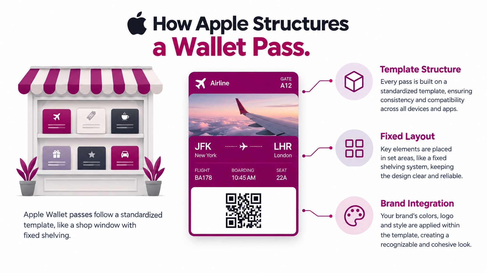
That template mindset is the skill to carry forward. Once the hierarchy is fixed, each later choice gets easier, because the question is no longer what looks nice, but what belongs in each slot.
Choosing the Right Fields for Points and Stamp Programs
For a points program or stamp card, the field order should follow urgency. The customer needs the most important status first, the staff needs redemption data second, and everything else should get out of the way. Apple's layout rules make that possible, but only if you place the right data in the right slots.
Put operational status in the visible zone
Apple warns not to add more fields than are visible on the front, because future layout changes could expose hidden data unexpectedly Apple Wallet guidance. That's a useful warning for any café or salon, because it means you should assume the front face is the only reliable place for essential information.
For loyalty cards, that usually means points balance, stamp count, or a member ID belongs in the header or primary field. Expiry details and reward thresholds can live lower in the hierarchy if they're important but not needed at every checkout. Less urgent notes, such as internal labels or back-office metadata, should stay off the front.
| Loyalty Field Placement Guide | ||
|---|---|---|
| Pass Data | Recommended Field | Why It Goes There |
| Points balance | Header or primary | It's the main status a cashier or customer checks first. |
| Stamp count | Header or primary | It shows progress toward the next reward at a glance. |
| Member ID | Header or primary | It helps staff confirm the account quickly if scanning fails. |
| Tier name | Secondary | It supports recognition, but it's not usually the first thing needed at checkout. |
| Expiry date | Secondary or auxiliary | It matters, but it usually doesn't need front-and-center prominence. |
Keep the front readable, not crowded
Apple also recommends semantic text fields instead of text baked into images, because image text isn't accessible and may not render reliably across devices Apple Wallet guidance. That matters because a hidden image label feels stylish in a mockup, then becomes a problem the moment the customer opens the pass on a different screen.
A good test is simple. If a barista can't point to the pass and say, “That's the balance, that's the ID, and that's the reward path,” then the hierarchy still needs work.
The smartest passes don't try to say everything. They say the one thing that gets the loyalty action moving, then they let the rest sit behind it.
Branding Your Pass Without Breaking the Layout
Branding works in Wallet when it helps recognition, not when it competes with readability. Apple explicitly encourages brand colors, icons, and full-art backgrounds for instant recognition, while also advising developers to avoid embedded text in images and keep files small for efficient delivery Apple Wallet design guidance. For a café, salon, or bakery, that means the pass should look like your business in a second, not like a miniature flyer.
Prepare the assets Apple expects
Apple's pass design guidance calls for exact asset sizes, including a 38×38 pixel icon, a 50-pixel-tall logo, a 30-pixel-tall primary logo, a 375×144 pixel strip image, and a thumbnail between 60 and 90 pixels wide Apple's archived Wallet Developer Guide. Those sizes matter because the format is constrained, and a pass that fits those slots well will usually look cleaner than one forced into them.
For a small merchant, the practical workflow is straightforward:
- Use the strongest brand color: Put it in the background or accent area so the card reads as yours right away.
- Keep the logo clean: Use a version that works at the designated sizes, not a crowded lockup with tiny text.
- Treat the strip image carefully: Use it for brand feel, not for readable copy.
- Keep files light: Smaller assets make delivery by email or web link smoother.
A long menu, a promo slogan, or opening hours inside the image usually backfires. The wallet pass has a job to do at checkout, and text baked into graphics tends to disappear into the device's scaling rules.
A branded pass should be recognizable from across the counter, but it should still read cleanly in the customer's hand.
The balance here is simple. Put your identity into the color, icon, and image treatment, then let the text fields do the work of communication. That's how a pass feels branded without becoming busy.
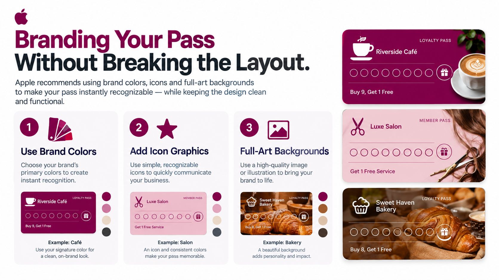
If you're designing for a café, think of the pass the way you'd think about a takeaway cup. The color and logo tell people whose cup it is. The important information still has to sit where the customer can read it quickly.
Accessibility and Cross-Device Consistency
A pass that looks fine on one iPhone can feel cramped on another device, and Apple notes that passes may render differently by device, including Apple Watch, where some images and information are reduced or unavailable Apple Wallet design guidance. That's why the same loyalty card should be judged on more than one screen before it goes live.
Why image text fails
Text inside images is a trap because it can't be treated like real content. Apple recommends semantic fields instead, which means the value lives in the pass data, not inside a logo or background graphic Apple Wallet guidance. If the customer depends on accessibility features, that difference matters immediately.
For a salon checkout, this shows up in a simple moment. A client raises an Apple Watch wrist, the receptionist glances down, and only part of the pass is visible. If the member ID or stamp progress is trapped in artwork, the staff member loses the detail they need.
Design for the smallest useful view
Apple's guidance also says white space may be cropped from some images, so decorative edges can't be trusted to survive every screen Apple's archived Wallet Developer Guide. The safer approach is to keep the core business information in the text fields and treat the artwork as supporting material.
That doesn't mean a pass has to look plain. It means the pass has to stay understandable when the screen shrinks. A well-designed loyalty pass should still answer the same question on iPhone and Apple Watch, what is this card, and what status does the customer have right now?
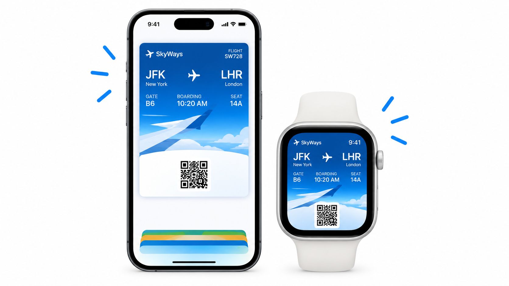
When a customer can open the pass on wrist or phone and the important text still lands clearly, the design has done its job. Accessibility and consistency aren't extras here, they're part of the basic usability contract.
Barcodes, Updates, and Keeping Passes Current
A café member reaches the register with a phone at two percent battery, or a salon client presents an Apple Watch in a crowded reception area. The pass still needs to identify the account quickly. Reliable scanning and current reward data depend on two separate decisions: how the pass is read and how its information is refreshed.
Build barcode fallbacks, not barcode faith
Apple supports barcodes generated from pass data instead of relying on an image. It also recommends placing multiple barcode formats in priority order to improve compatibility across devices and operating system versions, as explained in the Apple WWDC 2026 session on Wallet updates.
For a points or stamp program, set up a prioritized barcode array rather than betting the whole checkout on one format. Apple added support for EAN-13, Code 39, Codabar, and ITF in iOS 27. The same session notes that these options can help businesses serve customers using different devices and scanners.
Give staff a second route as well. Place a visible manual credential ID in a text field, such as the member number used by a café's register or a salon's booking system. If a scanner struggles with glare, distance, or an older reader, the employee can enter or verify that ID instead of stopping the transaction.
Keep balances and offers fresh
Apple Wallet passes can receive updates through push notifications. A changed point balance, stamp total, offer, or membership status can appear on the existing pass without requiring the customer to download a replacement.
That update flow matters because loyalty information changes during ordinary visits. A customer earns a stamp at the counter, reaches a reward threshold, or receives a time-limited offer. The pass should reflect that event soon after it happens, so the screen remains a useful account summary rather than an old receipt.
For merchants comparing tools, Apple Wallet loyalty cards for points and stamps is one option that supports wallet-ready cards and update flows. The practical test is simple: after launch, can the business change the customer's status while keeping the same pass available?
A pass with one barcode and one frozen balance is fragile. A pass with prioritized scan options, a fallback ID, and update support can keep checkout moving.
That is how a Wallet card becomes part of the daily loyalty process instead of a digital card customers stop trusting.
Your Pre-Launch Pass Design Checklist
Before you launch, run one last pass like a cashier would. The goal is to catch the things that look fine in a mockup but fail in the actual wallet.
- Essential status in the header: Can you see points, stamps, or member ID when the pass is collapsed?
- Front face uncluttered: Can you understand the pass without squinting or hunting for hidden fields?
- Branding feels clean: Does the background color and logo make the pass recognizably yours?
- No text baked into images: Is every important word in a real pass field?
- iPhone and Apple Watch tested: Does the pass still make sense when the screen gets smaller?
- Barcode fallback configured: Is there more than one supported barcode path?
- Credential ID visible: Can staff confirm the account if a scan doesn't work?
- Image files stay lightweight: Do the assets load smoothly when delivered by email or web link?
A quick launch is better than a perfect-looking draft that confuses customers. The design rules are tighter than a normal graphic project, but they're also easier to obey once you accept the format.
If you want a faster path, review how to create Apple Wallet passes and compare your draft against the checklist above. Designing inside Apple's rules is usually quicker than fighting them, and it gives your loyalty card a better chance of being used every day.
If you want a simpler way to build wallet-ready loyalty passes, Loyal Customer helps merchants run points and stamp programs from a phone and issue passes for Apple Wallet and Google Wallet. It also lets you preview and test the pass flow before launch, so you can check the design, the fields, and the update behavior in one place. Visit Loyal Customer to see how that fits your loyalty setup.