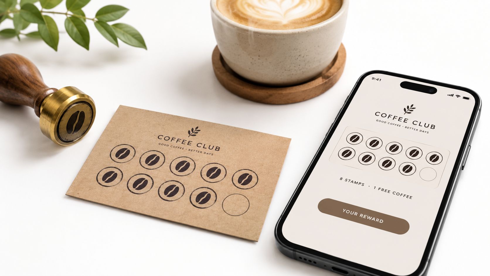
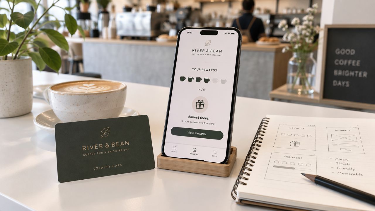
You've probably seen this happen. A customer buys a latte every morning, the paper punch card lives in a wallet for a week, then disappears into a drawer. The next time they walk in, they ask, “Do you still do loyalty cards?” and you realize the problem wasn't the reward, it was that the card never became part of the visit.
That's why good design a loyalty card work is really about behavior, not decoration. Consumers already juggle 8 loyalty programs on average and actively use only 5, so your card has to win attention inside a crowded wallet and earn repeat use fast, not just look polished once. Digital wallet passes help because they live where customers already reach for payment and identity, and the design challenge becomes simple recognition at a glance, not another piece of paper to remember. Loyal Customer's digital loyalty card guide fits that reality well, because the customer only cares whether the card shows up, scans, and feels worth reopening.
Table of Contents
- Why Most Loyalty Cards Get Forgotten and How to Fix It
- Choosing Your Rewards Model Before You Design
- Laying Out a Wallet Ready Card That Scans at a Glance
- Writing Copy and Progress Cues That Drive Repeat Visits
- Testing Launching and Measuring Your Loyalty Card
- Your Loyalty Card Design Checklist and Next Steps
Why Most Loyalty Cards Get Forgotten and How to Fix It
The fastest way to lose a loyalty customer is to make the card feel like homework. A café or salon can hand out the nicest printed punch card in town, but if the customer has to keep track of it, remember the rules, and figure out when it's worth bringing back, the card fades into the background. The bigger problem is that people already manage multiple memberships at once, so every extra step makes your program easier to ignore.
A wallet-ready card solves a different problem. It doesn't just enroll a customer, it creates a repeatable habit loop at the counter, because the pass is already on the phone and can be opened without a search. That's why simple earn-and-redeem rules, clear progress, and low-friction access matter more than elaborate branding.
What the customer should feel
Practical rule: If the customer can't tell, in a second or two, how close they are to a reward, the card is too hard to use.
For repeat-visit businesses, the goal is not to impress on day one. It's to make the next visit feel like the obvious place to continue a streak. Paper cards are easy to forget, while wallet passes are harder to misplace and easier to present when the cashier or stylist asks.
That shift changes the design brief. You're no longer trying to “get them to join,” you're trying to get them to keep using the card often enough to reach a reward milestone. The best card feels like a small, familiar object in the wallet stack, one the customer can identify instantly and trust to work every time.
Choosing Your Rewards Model Before You Design
Start with the reward mechanics, not the visuals. A points program and a digital stamp card look similar at a distance, but they solve different business problems and produce very different layouts. If you pick the wrong model first, you'll end up redesigning the card later because the economics and the interface don't match.
Use points when purchases vary a lot, like retail, gyms, or businesses where basket size changes from visit to visit. Points give you room for tiering, partial progress, and broader redemptions. Use stamps when the behavior is simple and repeatable, like coffee, bakery visits, cuts, color services, or other fixed-action purchases where “buy X, get 1 free” is easy for staff and customers to understand.
The broader market context matters too. A global customer loyalty benchmark found that 83.0% of program owners who measured ROI reported a positive return, and those programs generated an average of 5.3x the revenue relative to cost in 2026 Antavo's global customer loyalty report. That doesn't tell you which model to pick, but it does tell you why the model has to be trackable, visible, and easy to operate.
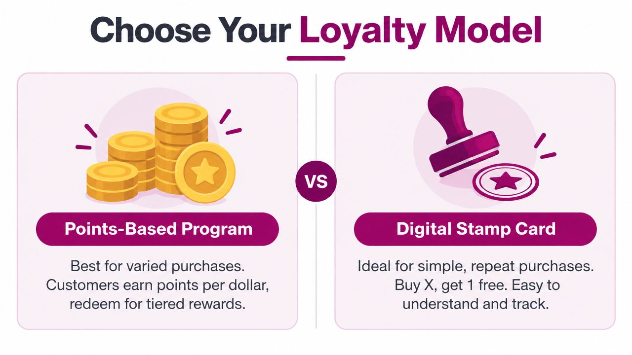
Points vs stamps and where each fits
| Feature | Points Program | Stamp Card |
|---|---|---|
| Customer understanding | Better for varied spend and flexible redemptions | Best for simple repeat purchases |
| Staff explanation | Needs a little more explanation | Usually self-explanatory |
| Layout complexity | Often needs balance, tier, and status fields | Usually needs a clean stamp count |
| Best fit | Retail, gyms, salons with varied tickets | Cafes, bakeries, quick-service repeats |
| Reward feel | More customizable | More immediate and visual |
A stamp card wins when the customer can understand the reward without asking a question.
Here's the cleanest rule of thumb. If you can explain the earning model in one sentence at the counter, stamps are usually the better choice. If the reward needs more nuance, points usually give you more room to work.
When you design a loyalty card, define the threshold before the artwork. A reward that feels reachable will drive use, while a reward that feels vague or far away won't. That decision shapes everything, from how much progress to show on the front to how much detail belongs on the back.
Laying Out a Wallet Ready Card That Scans at a Glance
A wallet pass has to make sense at thumbnail size first. If someone opens Apple Wallet or Google Wallet in line, the card should still show what it is, how far along the customer is, and what reward is waiting next. Everything else, support notes, legal copy, and longer terms, belongs on the back.
That front-loaded hierarchy matters because both wallets compress branding into a very small view. Google Wallet's classTemplateInfo.cardTemplateOverride gives you layout control, while Apple Wallet passes depend heavily on a strip image that still has to stay readable in the list and at thumbnail size. If the logo softens or the progress text cuts off, the pass starts to feel unreliable before anyone taps it.
What to put on the front
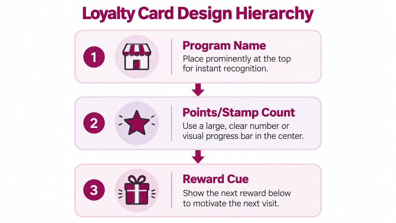
A front layout that works in practice usually follows this order.
- Program name first. Customers should recognize the pass before they inspect it.
- Progress second. Show a count, a balance, or a small visual marker.
- Reward cue third. Make the next reward obvious enough to pull in another visit.
Practical design guidance recommends a square or circular logo at least 150x150 px, with 300x300 px or higher preferred for sharper rendering, and an Apple Wallet strip image around 640x246 px at standard resolution, or 1280x492 px for 2x output design guidance for loyalty card assets. Those sizes reduce blur and awkward cropping, two problems that make a pass feel unfinished fast.
Keep the count believable
Stamp cards need the same discipline. Guidance for stamp-based programs suggests 6 to 10 stamps feels achievable, while more than 12 can look crowded and weaken the sense of progress. That matters because a customer can glance at a pass and decide, in a second, that the reward feels too far away.
For merchants, the design lesson is simple. Keep the front focused on the wallet pass, not the full program rules. A small screen gives you one short attention window, so use it to answer the only question that matters, how close am I?
This wallet loyalty card guide is a useful reminder that the pass is the product, not just the wrapper around it.
Writing Copy and Progress Cues That Drive Repeat Visits
The copy on a loyalty card should sound like a checkout cue, not a marketing brochure. The best front-of-pass text is short, literal, and easy to read while someone is standing at the register or washing hands after a salon service. Long taglines and clever reward names usually get in the way of the one thing that matters, which is showing the next visit is worth making.
A strong status line tells the customer where they stand right now. In a coffee shop, that might be a plain balance or stamp count. In a salon, it might be a simple “Your next reward is getting close” line paired with a visible progress marker. In retail, a tier label can work if it stays short and doesn't bury the balance.
Write for repeat scanning, not first impressions
The card should give the customer a reason to reopen it without making them decode the program every time. That means using language that supports habit, such as “3 of 10,” “1 stamp added,” or “Reward ready after your next visit,” instead of vague phrasing like “Thanks for being a member.”
Back-of-pass text can carry the longer material, but keep it tight there too. Support links, terms, and redemption notes should be easy to find and even easier to ignore unless needed. The front exists to trigger action, while the back exists to prevent confusion.
The copy should answer three questions fast, what is this, how close am I, and what happens next?
If you're working from a stamp model, the internal logic should feel visible. Digital punch card guidance works best when the progress cue makes the next step obvious, because the customer doesn't need a paragraph, they need a nudge.
Avoid reward names that sound cute but hide meaning. “Sunshine Club Perk” may suit a brand moodboard, but “Free drink after 10 visits” gets used more often because staff can say it quickly and customers can remember it without effort. The more the language behaves like a receipt line, the easier it is to keep the habit alive.
Testing Launching and Measuring Your Loyalty Card
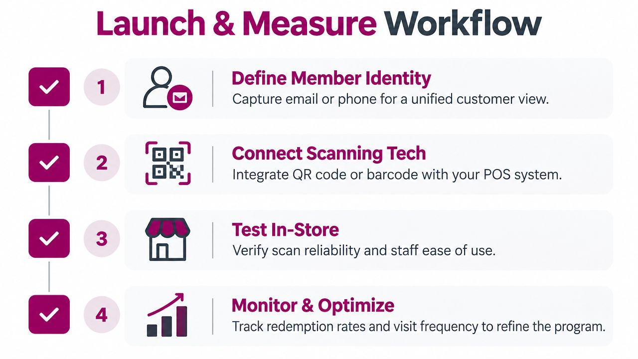
A loyalty card launch should feel like a checkout process, not a brand reveal. Before it goes live, define the source of truth for member identity, connect the QR or barcode to the POS or scanning flow, and test it in a real store with the lights on, the line moving, and staff using the same device they use every day. That is where design files meet the counter.
Enrollment needs to stay light. A QR code at the counter or a link on the receipt usually beats a long sign-up flow, because each extra step lowers completion and repeat use. The pass should also refresh the balance quickly after each visit, since stale data makes customers wonder whether the stamp or points posted.
What to measure after launch
The first checks are operational.
- Save rate. Are customers adding the pass to their wallet?
- Scan rate. Are they presenting it during visits?
- Redemption rate. Are rewards being used?
- Update latency. Does the balance refresh fast enough to feel trustworthy?
Launching an empty pass is a common mistake. If the customer opens the card and sees no progress, the program looks unfinished. Seed the first visit or first balance so the pass already feels active when it lands on the phone.
Plan the failure cases before you need them. Staff should know what to do if a scan fails, if duplicate accounts appear, or if a field update lags behind the purchase. Those issues affect redemption confidence quickly, and once staff stop trusting the pass, adoption drops at the counter.
Wallet choice should match the audience, not a guess. Coverage patterns vary by market, with iPhone share stronger in places like the US, UK, Australia, and Switzerland, while Android is stronger in parts of Eastern Europe, Asia, and Latin America wallet market coverage guidance. In many places, supporting both Apple Wallet and Google Wallet is the safer default, especially when you want the card to work on the phones customers already carry.
A wallet-native loyalty card can also be managed from a phone-first tool, which helps smaller teams move faster without treating the launch like a software project. One example is Loyal Customer, which lets merchants run points or digital stamp cards and issue Apple Wallet and Google Wallet passes from a phone.
Your Loyalty Card Design Checklist and Next Steps
A strong loyalty card is the one customers can recognize, scan, and understand without thinking. Before launch, check the front hierarchy, reward achievability, wallet readability, and staff confidence at the counter. If any of those fail, the card may look finished but still behave like a dead program.
Use this order of operations. First, pick the reward model that matches the visit pattern. Then make the pass readable in list view and at thumbnail size. After that, test the enrollment flow, the scan flow, and the balance refresh in a real store. Only then worry about polish like color balance or decorative details.
The true test is whether the card becomes part of the visit routine. If customers can open it quickly, see meaningful progress, and trust that the next scan will count, the program has a chance to stick. If they hesitate, the design is asking too much from a small moment at checkout.
Keep the card simple enough that staff can explain it while handing back change or packing an order.
If you're ready to build one, start with a wallet-native pass that matches your actual audience and your actual reward model, then refine it from real redemption behavior. The fastest way to improve loyalty design is to launch, watch what gets scanned, and adjust the pass instead of guessing from a mockup.
If you want a practical way to design, issue, and update wallet-ready loyalty passes without overcomplicating the setup, visit Loyal Customer. It's built for points and stamp cards on Apple Wallet and Google Wallet, which makes it a direct fit for businesses that care more about repeat visits than flashy mockups.